
Repositioning Premier Protein from a functional nutrition product into a more energetic lifestyle brand for younger, active consumers.
Art Direction, Visual Identity, Motion Design
Emily He
Premier Protein already communicated function clearly, but its visual identity left room to build a stronger emotional connection with younger consumers who see nutrition as part of an active lifestyle.
Shift the brand story from simply providing protein to providing momentum — a product that fits into work, movement, fitness, and everyday routines.
The rebrand was built around one central idea: protein is not the end benefit — it supports what people want to do next. This led to the campaign direction “Fuel Up, Feel Unstoppable.” The visual system needed to communicate energy and confidence while still feeling credible as a nutrition brand.
Focus the brand toward younger, health-conscious consumers and active professionals who integrate convenient nutrition into everyday life.
Move beyond a purely functional supplement message and create a brand that can participate naturally in fitness, work, and lifestyle culture.
Build a visual language that feels bold, energetic, direct, and contemporary without losing the product's sense of reliability.
Carry the same positioning across identity, packaging, motion, merchandise, and campaign storytelling instead of treating each deliverable separately.
The identity needed to feel less static and more connected to movement. The redesigned mark and stronger typographic treatment create a bolder foundation that can scale from packaging to campaign graphics.
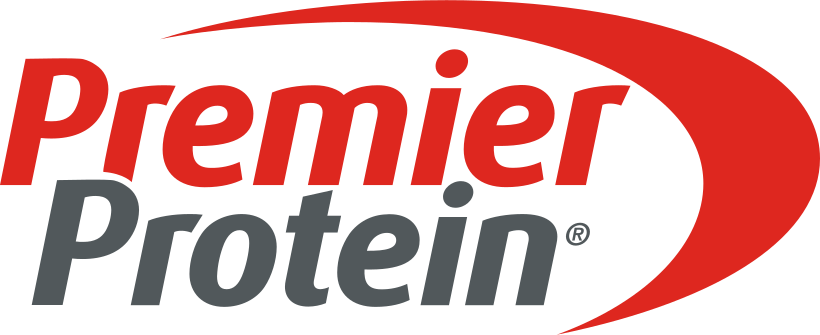 ORIGINAL
REBRAND
ORIGINAL
REBRAND
Rather than relying on decorative changes alone, the system uses contrast, bold typography, and a focused palette to create a more confident and recognizable brand personality.
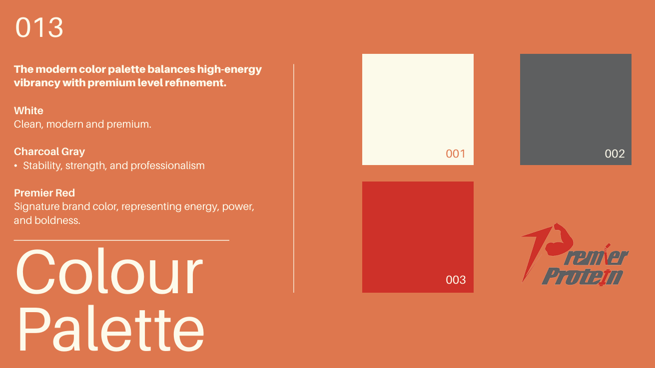
Charcoal creates a stable foundation while Premier Red introduces energy and gives the system a strong visual accent.
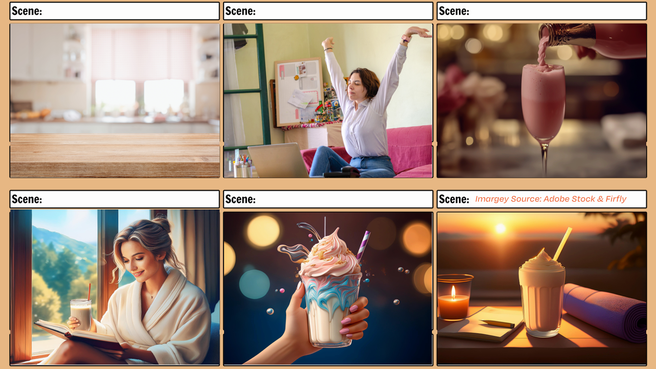
Motion gave the new positioning a chance to behave, not just appear on a package. The campaign follows Premier Protein through active everyday moments, translating “Fuel Up, Feel Unstoppable” into pace, movement, and lifestyle imagery.
Storyboarding helped connect the campaign message to specific shots, transitions, and moments of product integration before production. This kept the video focused on the lifestyle idea rather than becoming a sequence of disconnected product shots.
The identity was extended into packaging and merchandise to test whether the new system could remain recognizable across both retail and lifestyle touchpoints.
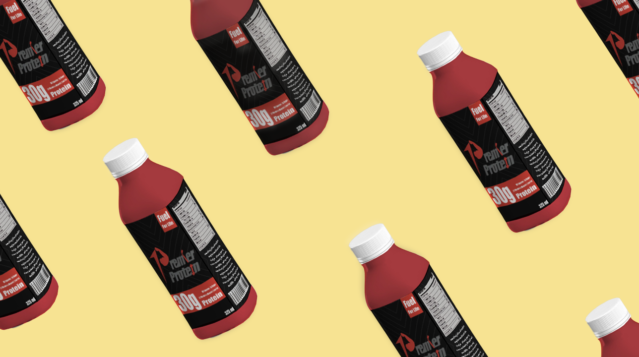
The packaging applies the stronger hierarchy, palette, and identity system to create a more unified expression at the product level.
A rebrand becomes stronger when every execution is tied back to the same positioning idea rather than simply sharing the same colors and logo.
The project helped us think beyond visual identity and consider how audience, message, channel, and creative execution work together as one campaign system.
We learned to translate an abstract brand personality into concrete choices across typography, color, packaging, motion, and storytelling.
We would validate the repositioning with target consumers and compare different campaign messages and creative executions before refining the final direction.